Alida Sayer’s Typography Treasures

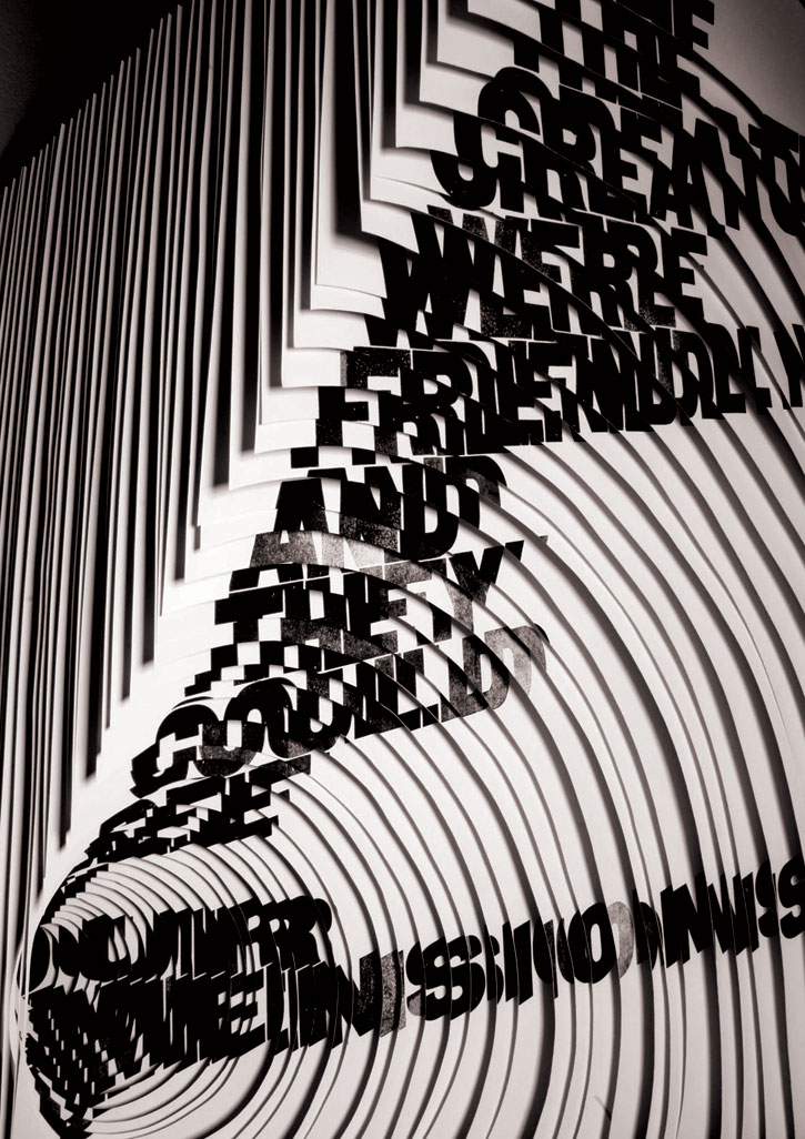
Sayer's 'Slaughterhouse Five'. Image from yatzer.com
Typography, meet your newest darling—Alida Sayer. Even though this lady has only been on the typography scene for a year, her impressive breakthrough exhibition won a ‘Best New Blood Award’ at the D&AD New Blood 2009 exhibition.
The Glasgow’s School of Art‘s Visual Communications Design graduate is certainly one to watch. Sayer uses layering as her inspiration and medium. She draws themes on visual culture from books such as such as Vonnegut’s “Slaughterhouse Five” which she named her latest exhibit after. On why the book inspired her, Sayer explains to Yatzer that, “I was particularly inspired by the concept of an alien race conceived by the confused mind of the main character who is trying to come to terms with difficult memories. To me the challenge of “visualizing time” this way or trying to communicate visually what it could be like to see the past, present and future all at once was a very exciting prospect.”
Sayer uses scalpel handiwork to achieve her cutting and transparent sheets to initially plot her work before creating her final masterpieces.
In an interview with Yatzer, Sayer explains her newfound love for typography: “I discovered that typography provided the perfect formal framework from which to ‘hang’ my ideas. It allowed my imagination to run wild whilst still retaining a layer of universally recognizable information.” Her most striking work to date? A hand cut 78-layer hanging piece from her Slaughterhouse Five collection.
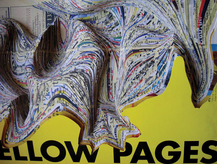
In Sayer’s case, form and meaning often interact in a stunningly creative manner. In her work ‘Yellow Pages’, Sayer uses layers of colour and print to symbolize the public mass.
In future projects, Sayer tells Yatzer that she’d like to experiment with larger scale work: “Something you could walk right into!”
-Cora Nijhawan

Sayer's 'Yellow Pages'. Image from yatzer.com


